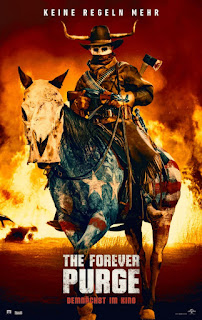
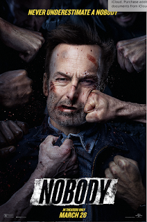
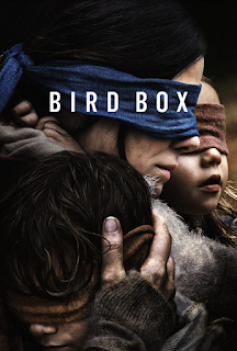
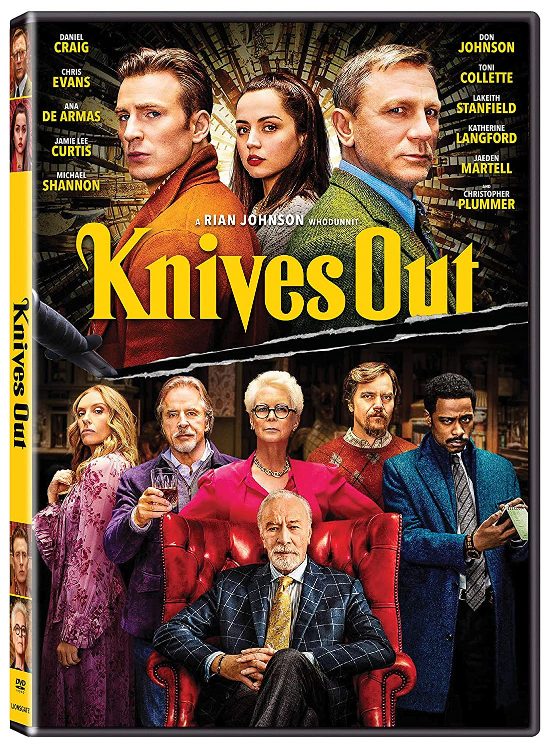
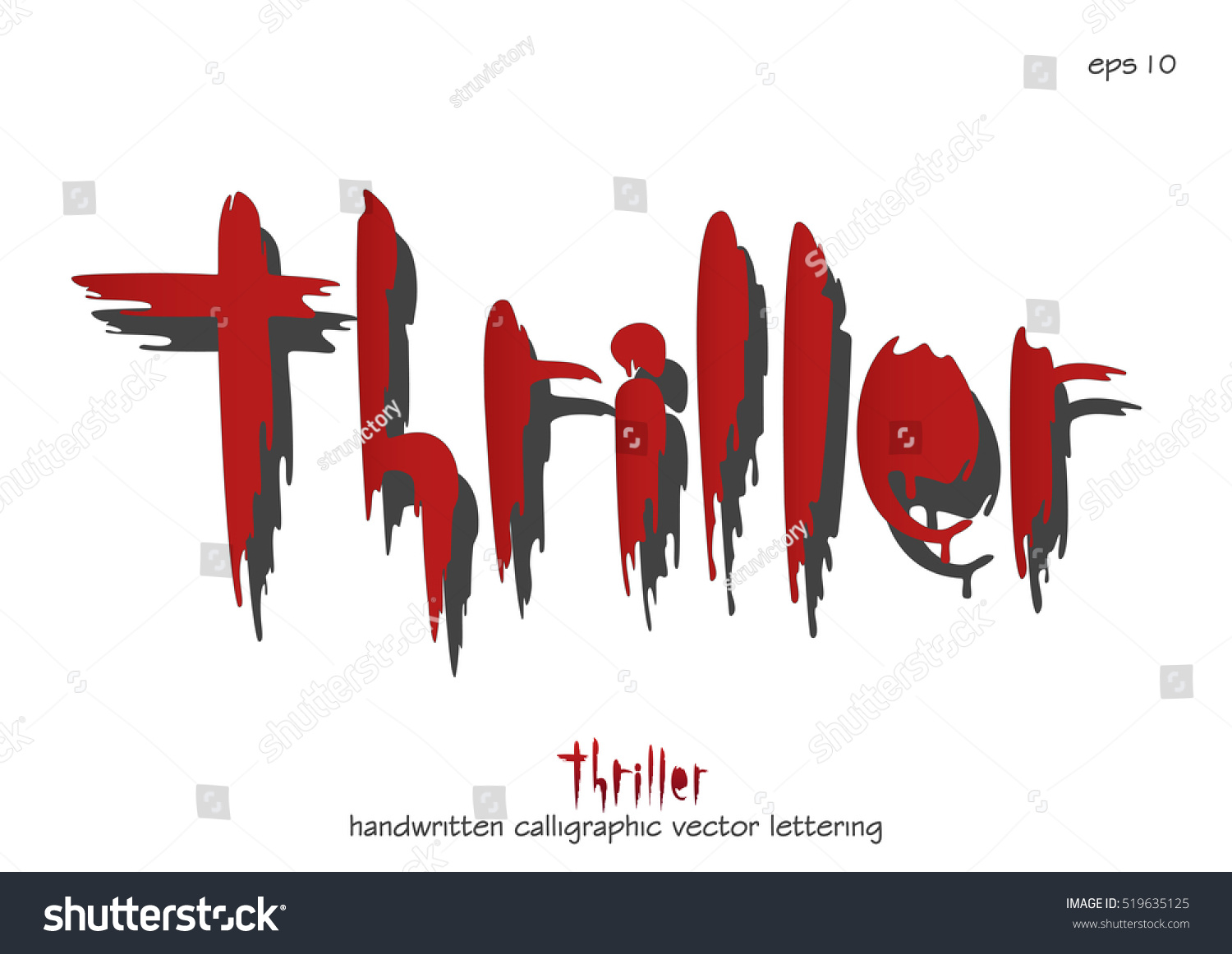
What My Titles Are Going To Look Like

I have three types of titles for my credits: names (including the producers companies), title, and time. Names- Font: "Noteworthy Bold" I find this font fitting because the film has an aspect of the victim writing in a diary and this font resembles handwriting. I decided on bold instead of regular so that it's easier to read. Size and Color: The size is going to be 50, just big enough to read but it doesn't block anything. The color will most likely be white so that it doesn't blend in the background, I plan on making my scenes dark and minimize lightness. The company names will be 80 sized because they are typically bigger than the actors names. Transition and Location: The transition in which it will appear is called "Gravity", this makes the letters appear as if they were falling out of thin air, then they just fade away. The location of these titles will be in the lower left corner to make sure they don't cover anything. The company names how...
